
Blog Page
All the latest articles to level up your design, brand, and presentation skills.
Recent blog posts
Hala Ahmed • April 14, 2026
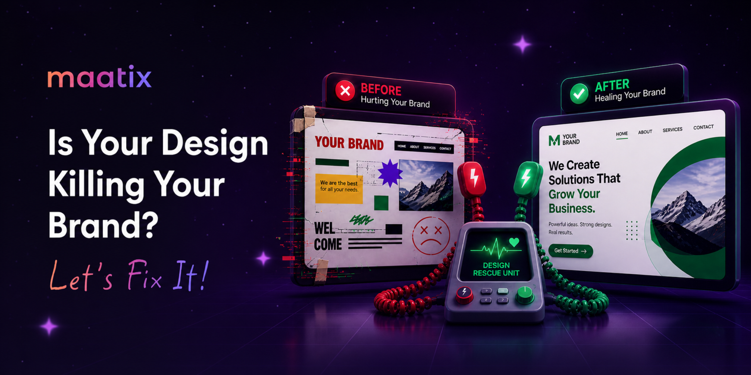
From Idea to Impact: Why Maatix is the Secret Weapon for Busy Creators
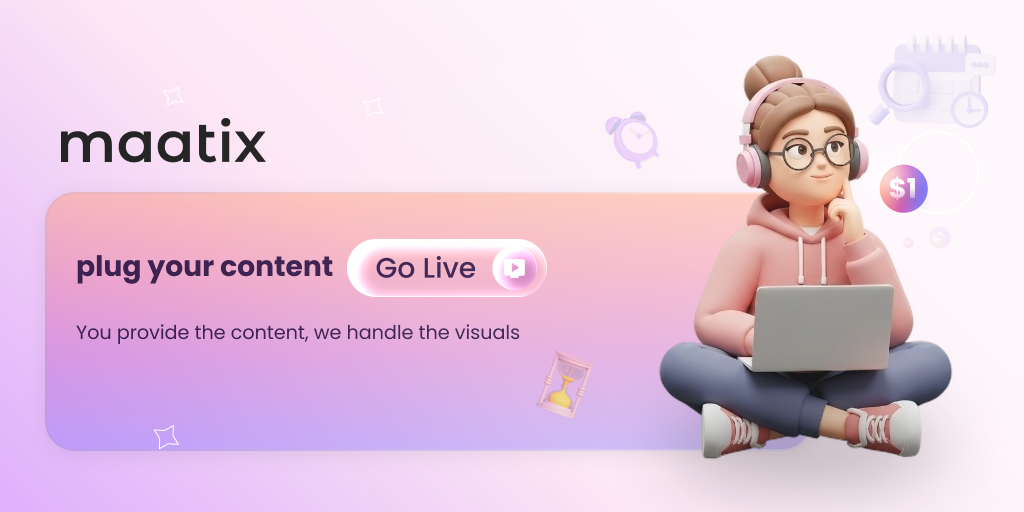
You have the expertise. You have a story to tell. You have the perfect strategy. But there is one thing standing between your great idea and a successful launch: The Design Gap.We’ve all been there , staring at a blank screen, trying to figure out which fonts match, how to align icons, or where to find high-quality graphics. Before you know it, you’ve spent five hours on design and zero hours on your actual message.At Maatix, we believe you shouldn’t have to be a graphic designer to look like a professional. Our mission is simple: You provide the content, we handle the visuals.The Problem: Content is King, but Visuals are the CrownIn today’s digital landscape, attention is the most valuable currency. You could have the most life-changing information in the world, but if it’s presented on a messy, outdated slide deck or a boring document, your audience will tune out.However,
Hala Ahmed • March 29, 2026
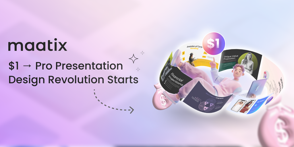
One Dollar Design Revolution
The world of professional design was once a fortress for the eliteWhile ambitious founders and students settled for lackluster slidesHigh paywalls acted as barriers to the growth of great ideasCreativity felt trapped behind expensive and complex licensesEvery visionary deserves a stage that reflects their inner fireMaatix rose to challenge these outdated rules of the creative gameThe revolution began with a single spark of radical accessibilityBy launching a platform where elite designs start at only one dollarWe removed the massive weight of cost from the shoulders of creatorsNow a single coin can transform a simple pitch into a masterpieceOur mission is to democratize high-end design for the global tribeMaatix has become the heartbeat of a more inclusive digital worldAffordability does not mean we ever compromise on visual excellenceEvery template and icon is meticulously crafted by master designersWe focus on modern aesthetics that capture every viewer’s attentionThese assets are built to be


