
Blog Page
All the latest articles to level up your design, brand, and presentation skills.
Recent blog posts

admin • May 21, 2026
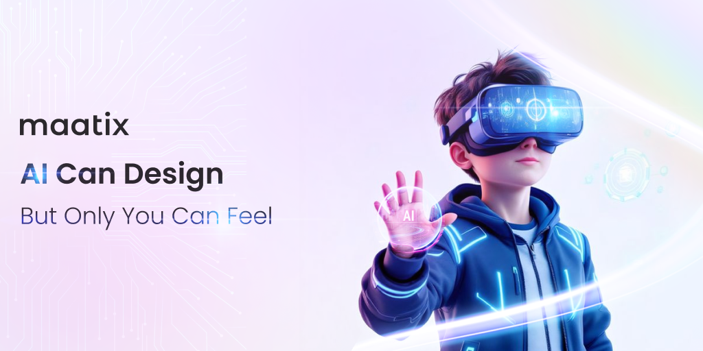
The Sentient Designer: Why Your Intuition is the Ultimate AI Prompt
AI is rapidly changing how we create visuals in the modern worldAlgorithms can generate thousands of complex patterns in mere secondsWhile machines offer incredible speed they lack a strategic soulTechnology is a powerful tool but never the master of the craftWe stand at a crossroads between total automation and intuitionMaatix believes that the future belongs to the felt experienceOnly the human heart can truly navigate the vast digital unknownDesign is about more than just a correct arrangement of glowing pixelsIt is the visceral response that makes a brand truly unforgettableAn AI can follow rules but it cannot understand a nostalgic memoryTrue connection happens when a viewer feels a deep and real emotionWe crave the “human touch” in an increasingly automated workspaceYour unique perspective is the missing piece in every digital promptMaatix empowers you to infuse your projects with a deeper meaningWearing the lens of the future requires a bold and
admin • May 14, 2026
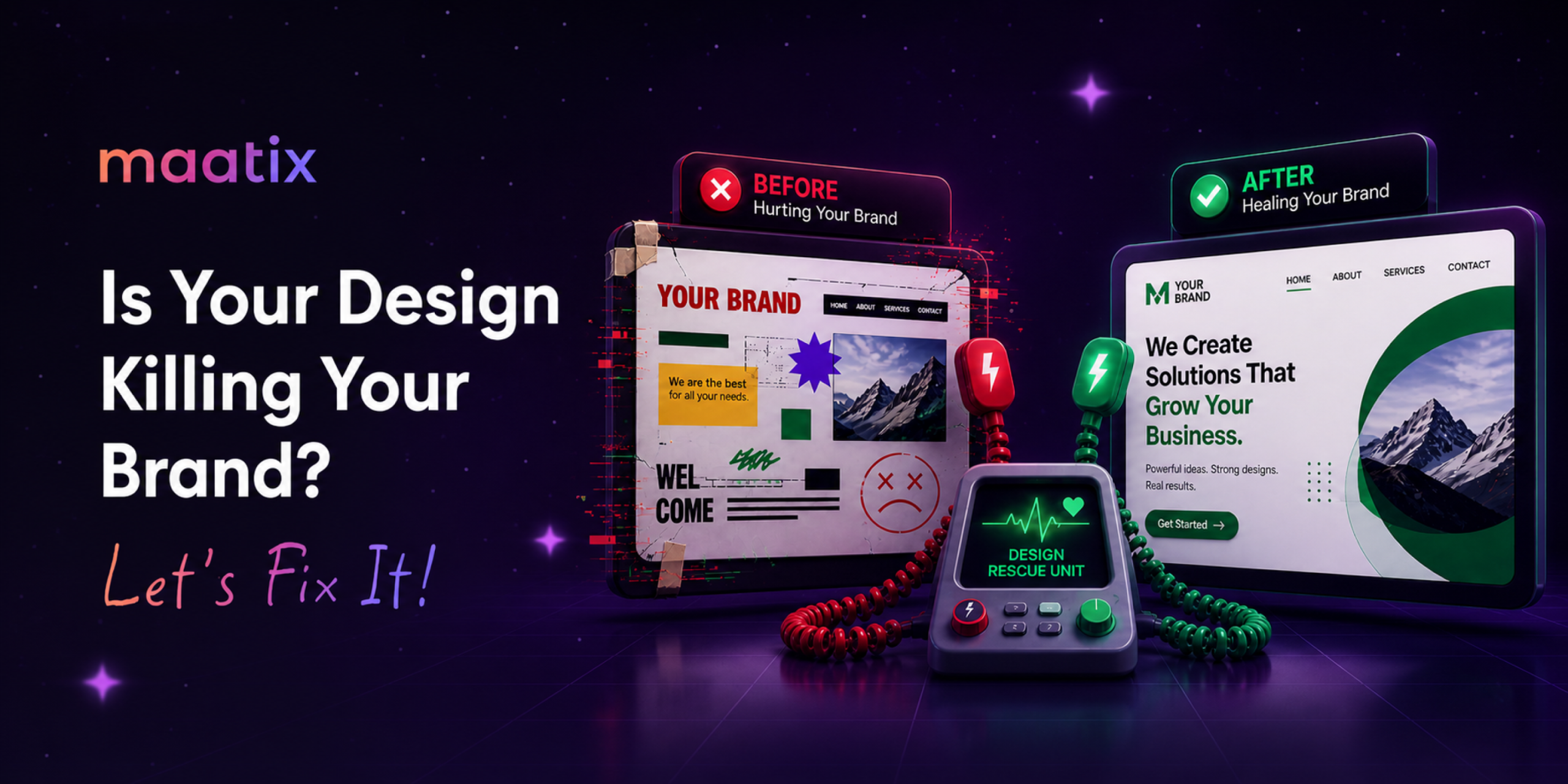
The Design Rescue Unit: Healing Your Brand from Visual Chaos
Bad design is a silent killer that slowly drains your professional credibilityA cluttered and chaotic interface signals a lack of care to your visitorsWhile your ideas might be brilliant they are buried under visual noiseFirst impressions are formed in a fraction of a second on the screenOutdated aesthetics act as a barrier between your brand and its successIt is time to recognize when your current visuals are doing more harmGlitched layouts and clashing colors create a sense of deep user frustrationConfused visitors will quickly leave for a brand that offers visual peaceAn unprofessional look makes potential partners question your true valueInconsistency across platforms dilutes the power of your core messageDesign should be a bridge to understanding rather than a wall of doubtHealing your brand begins with a thorough diagnosis of these visual flawsMaatix acts as a specialized rescue unit for your struggling digital identityWe provide the life-support your visuals need


