
Blog Page
All the latest articles to level up your design, brand, and presentation skills.
Recent blog posts

Hala Ahmed • March 17, 2026
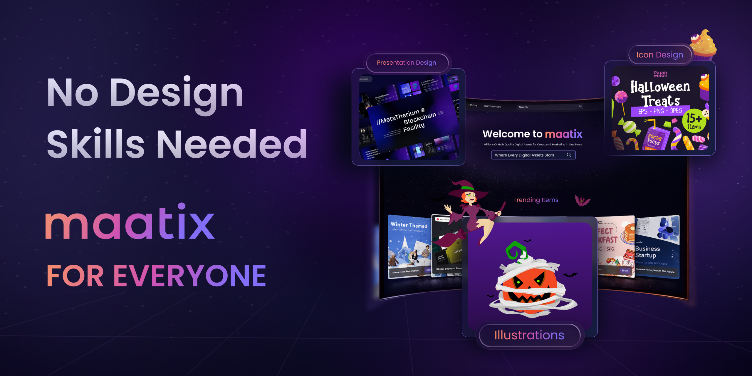
The Secret to Stunning Graphics? It’s Not Design Skills.
You’ve got the brilliant idea. You’ve crafted the killer marketing strategy. You’ve written the perfect blog post. You’re ready to share your vision with the world, but then you hit the wall—the design bottleneck. Suddenly, you’re stuck, spending hours trying to make something look professional, only to end up with a result that feels generic and fails to do your idea justice.What if you could bypass that entire struggle? What if you had access to a professional designer’s toolkit, without needing years of training or a massive budget? This isn’t a far-off dream; it’s a new reality for creators everywhere. The secret to consistently producing stunning graphics isn’t about mastering complex software—it’s about having the right assets at your fingertips.Welcome to Maatix: High-Quality Design for EveryoneThis is the very principle we’ve built at Maatix. We believe great ideas deserve great design, period. Maatix is a curated universe of premium digital
Hala Ahmed • March 5, 2026
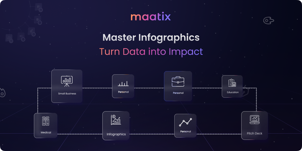
The Art of Visual Data, An Infographic Mastery Guide
Data is everywhere but raw numbers rarely inspire action or change.In our fast-paced world people crave speed and visual clarity today.A wall of text is often ignored while a graphic is remembered.Maatix believes that infographics are the ultimate bridge to success.They transform cold statistics into a warm and compelling message.Mastering this art form is essential for every modern professional.Let’s explore how to turn your complex ideas into visual impact.The first step to mastery is finding the story within your data.Every great infographic follows a clear path from start to finish.Identify the core problem before you even touch a design tool.A logical flow keeps your audience engaged until the very end.Without a strong narrative your charts are just scattered shapes.Structure your information so the conclusion feels truly inevitable.Maatix assets are built to support this essential storytelling loop.Visual hierarchy is the invisible hand that guides a viewer’s eye.Master designers use scale and


